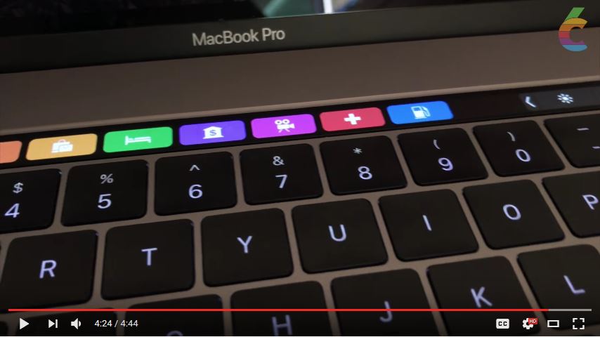
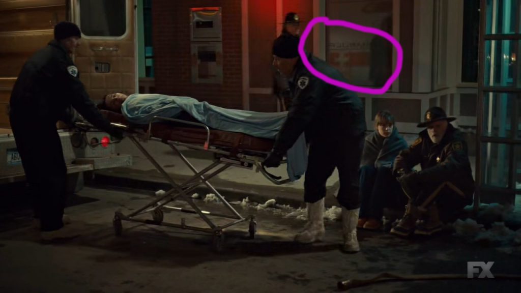
Eagle-eyed reader MFA has spotted the following creative misuse of the Swiss flag on Apple’s MacBook Pro touch bar when using the Maps application:
And they even made mistakes! The Swiss flag has a ratio of 1:1, not 2:1 as shown here. There is only a variant with 2:3. Also, the red they used isn’t quite right, one of the proper reds would be Pantone Red 032 C. Not quite #F00, more like #F00000.
And here I thought Apple cared so much about getting their design right. Tsk, tsk.
